process
work

student: Chloe Sin

course: VDES 15738

project: Project 1

term: Spring / Summer 2026

01

Lettering Practice

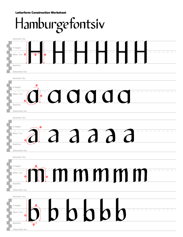
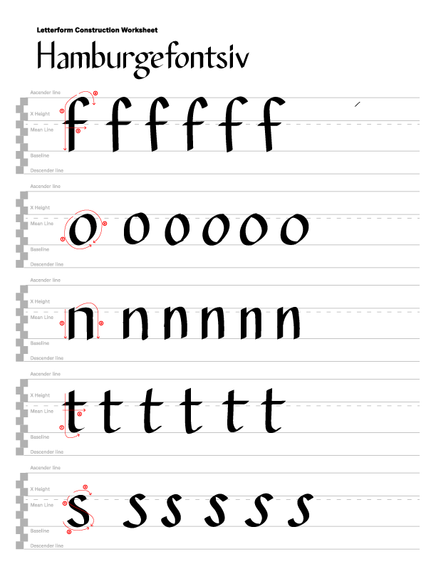
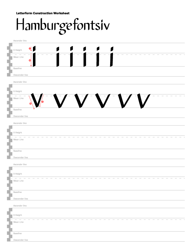
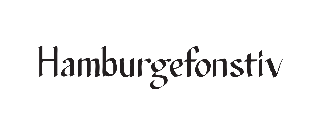
Hand-drawn exploration of letterforms, studying stroke order, weight distribution, and the relationship between positive and negative space within each character.

lettering
practice
Lettering practice 1>
Lettering practice — 01
Lettering practice 1>
Lettering practice — 02
Lettering practice 1>
Lettering practice — 03
Lettering practice 1>
Lettering practice — 04
Lettering practice 1>
Lettering practice — 04
Reflection

Through this letterform construction exercise, I observed how individual characters are built from recurring structural elements such as stems, bowls, shoulders, and terminals. Reconstructing the letters helped me recognize the consistency of stroke contrast, proportions, and spacing throughout the typeface. One challenge was accurately identifying how curved forms connect to vertical strokes while maintaining the original rhythm and balance of the design. I also found it difficult to replicate subtle details such as stress, terminals, and stroke transitions without disrupting the overall character shape. This process strengthened my understanding of typographic anatomy and showed me how small design decisions contribute to the visual personality and classification of a typeface.
02

Adobe Illustrator
Exporting Practices

Experiments with exporting vector artwork from Adobe Illustrator — including a failed attempt that revealed important lessons about file format, artboard sizing, and SVG rendering.

illustrator
export
(failed)
Export attempt 1>
Export attempt — 01
Export attempt 2>
Export attempt — 02
Obstacles

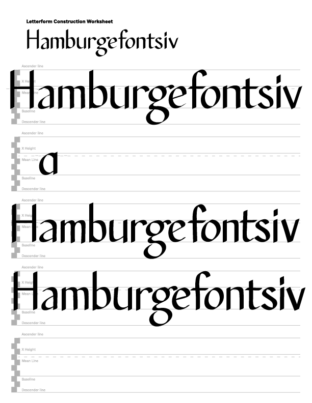
Reconstructing the letters by ocmbining my attempts, letter by letter together, helped me better understand how consistency in stroke contrast, proportions, and spacing contributes to the overall appearance of a typeface. One challenge I encountered was that when I initially saved my work as an SVG file, many of the strokes became broken, distorted, and messy, making the letterforms appear incorrect. After troubleshooting the issue, I learned that exporting the artwork as an SVG rather than simply saving it preserved the vector paths properly and maintained the integrity of the letterforms. This experience taught me not only more about typographic construction but also the importance of understanding file formats and export settings when preparing vector-based work.

Reflection

I realized that constructing letterforms requires much more attention to detail than I initially expected. While recreating the characters, I became more aware of how stroke contrast, spacing, and structural elements work together to create a cohesive typeface. I also struggled with a technical issue where my letterforms became distorted and the strokes appeared messy after saving the file as an SVG. Through trial and error, I learned that exporting the file as an SVG instead of saving it preserved the artwork correctly. This taught me the importance of both understanding typographic anatomy and using the proper production workflow when preparing vector files.

03

Reverse Engineering
Letters

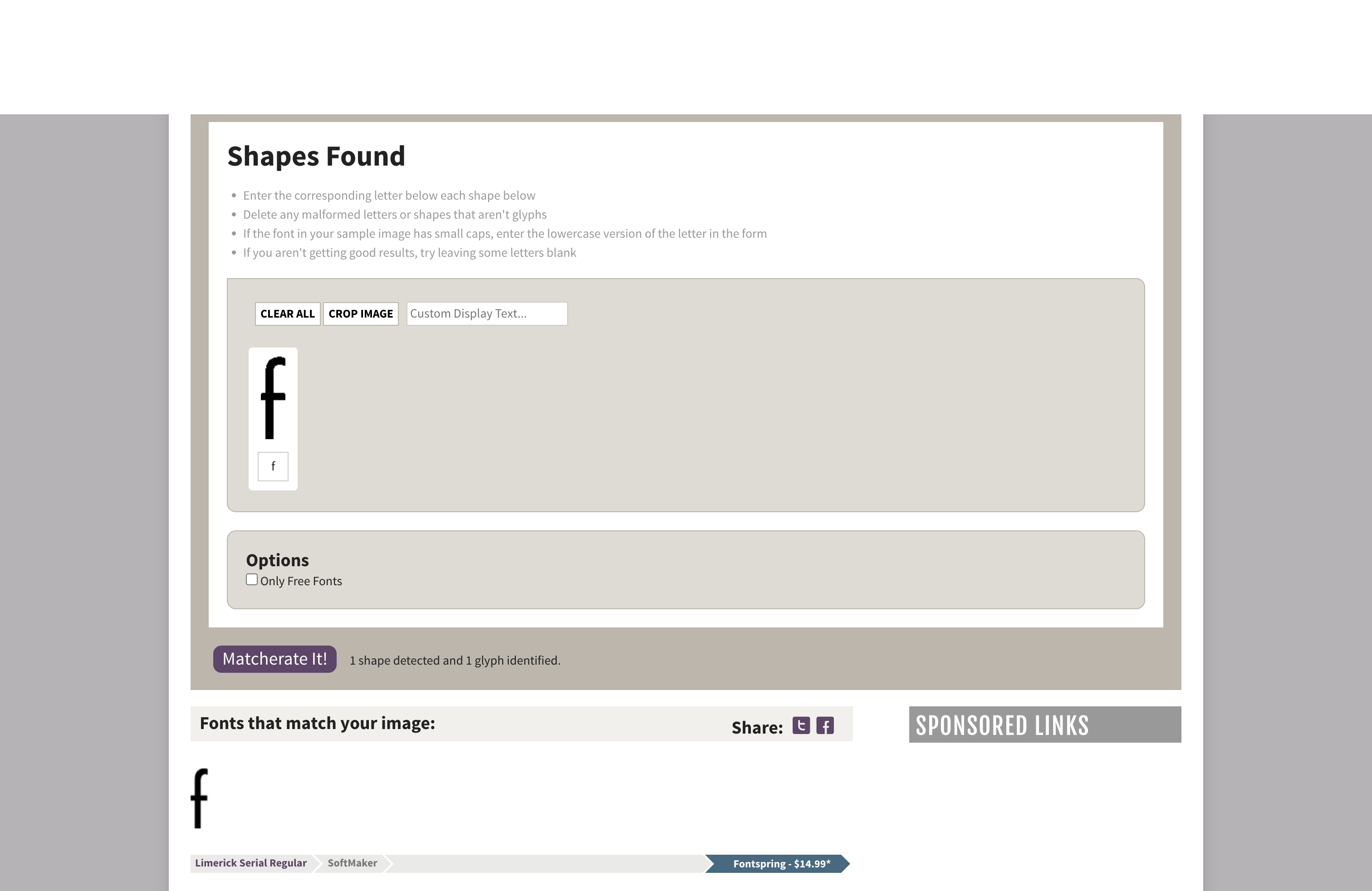
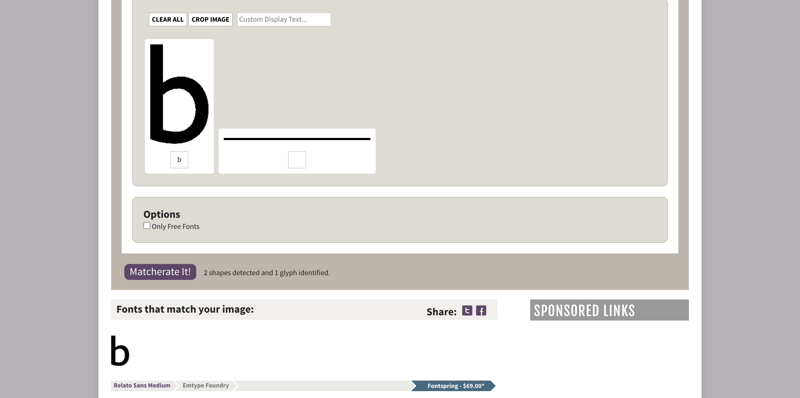
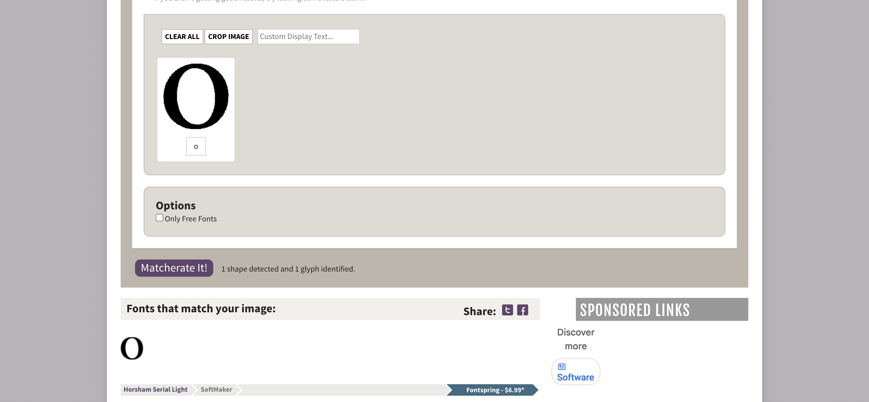
Deconstructing existing letterforms to understand their underlying geometry — tracing stems, bowls, terminals, and proportional relationships between each part of the glyph.

reverse
engineering
Reverse engineering — 01
Reverse engineering — 02
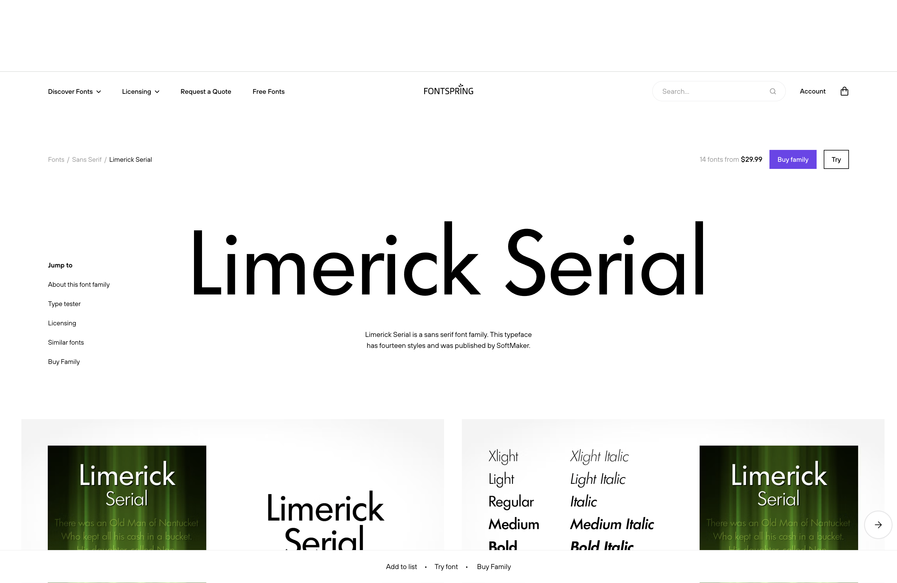
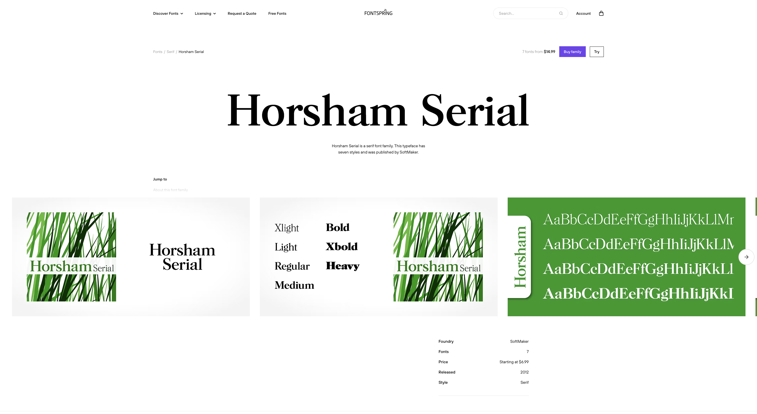
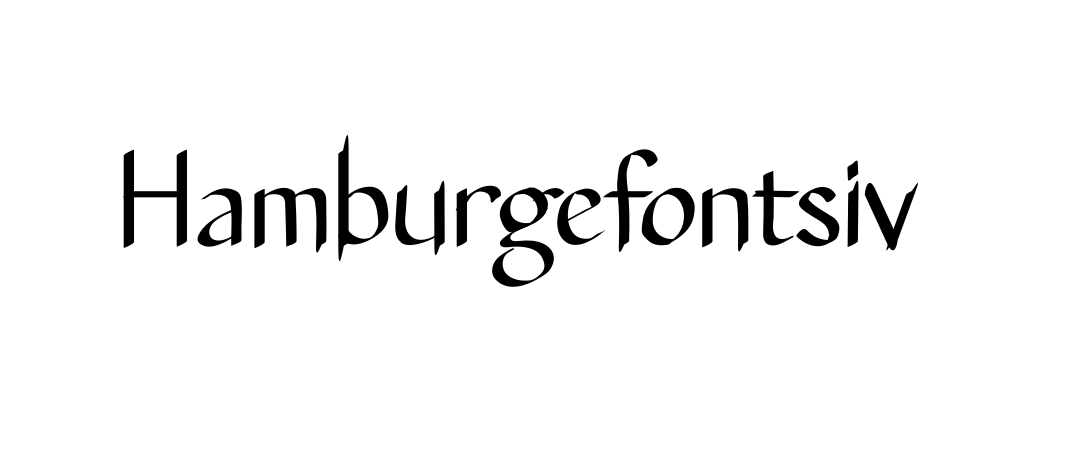
Analyzing font — 02
Reverse engineering — 03
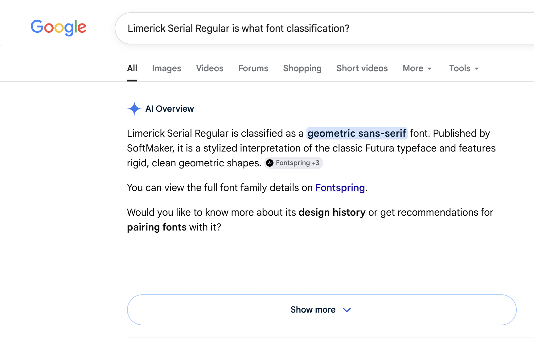
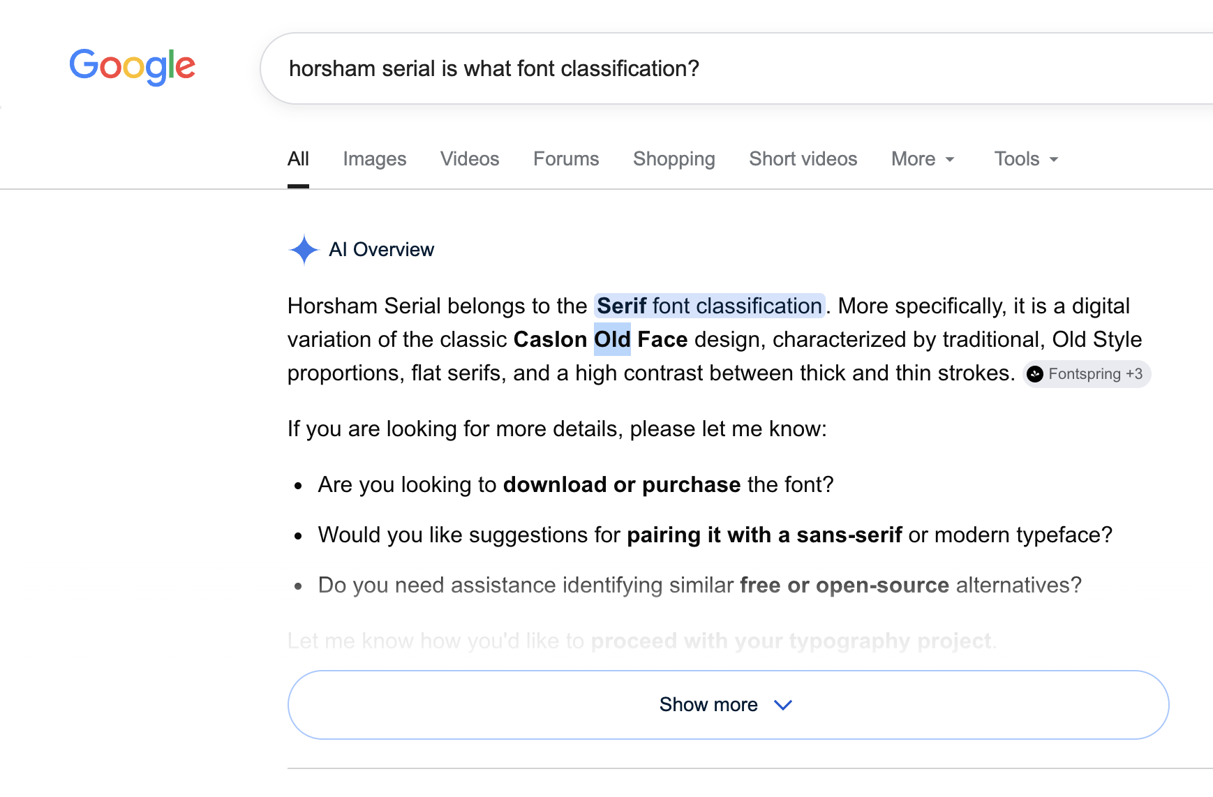
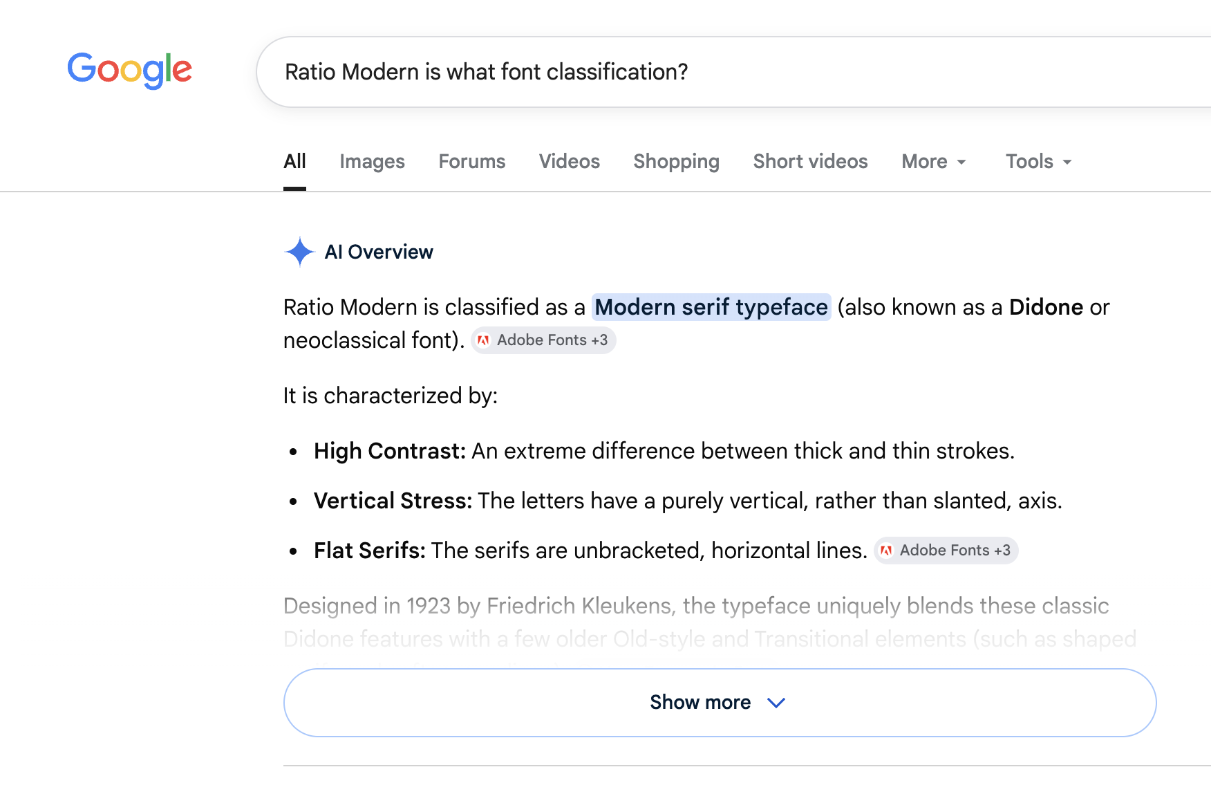
Google Search — 03
Reverse engineering — 04
Reverse engineering — 05
Analyzing font — 05
Reverse engineering — 06
Google Search — 06
Reverse engineering — 07
Reverse engineering — 08
Analyzing font — 08
Reverse engineering — 09
Google Search — 09
Reverse engineering — 10
Reverse engineering — 11
Analyzing font — 11
Reverse engineering — 12
Google Search — 12
Reflection

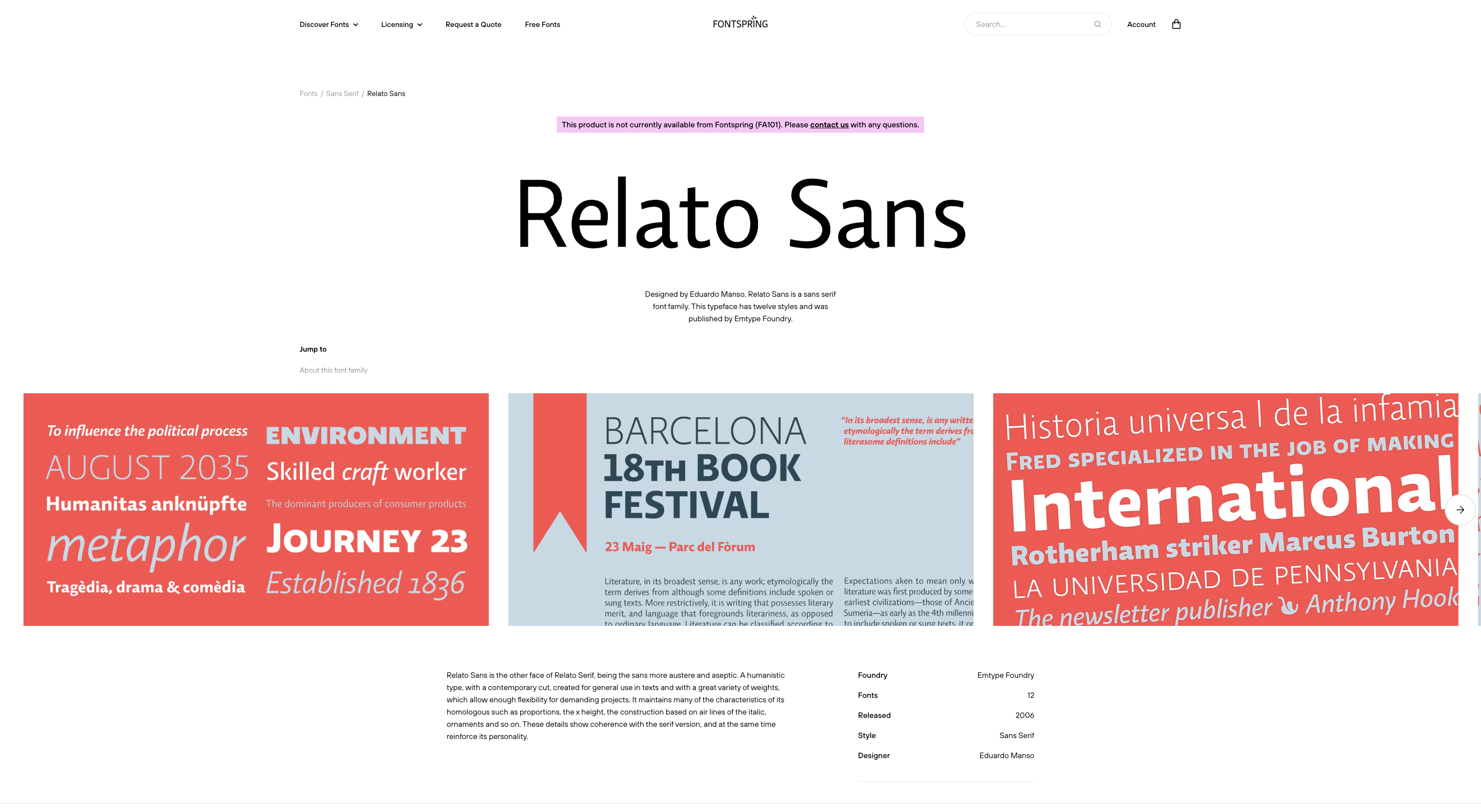
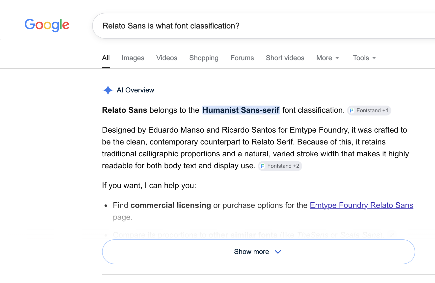
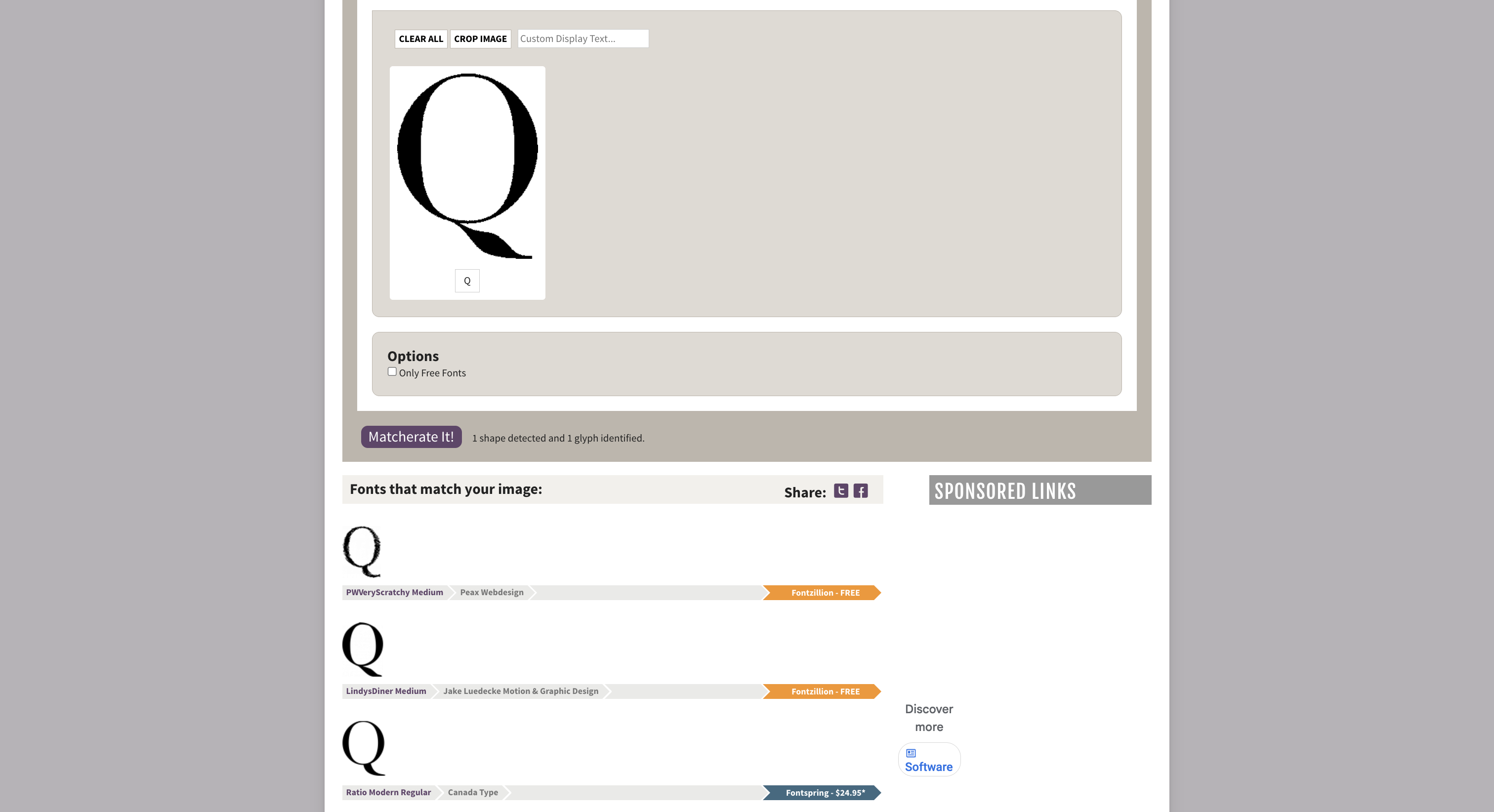
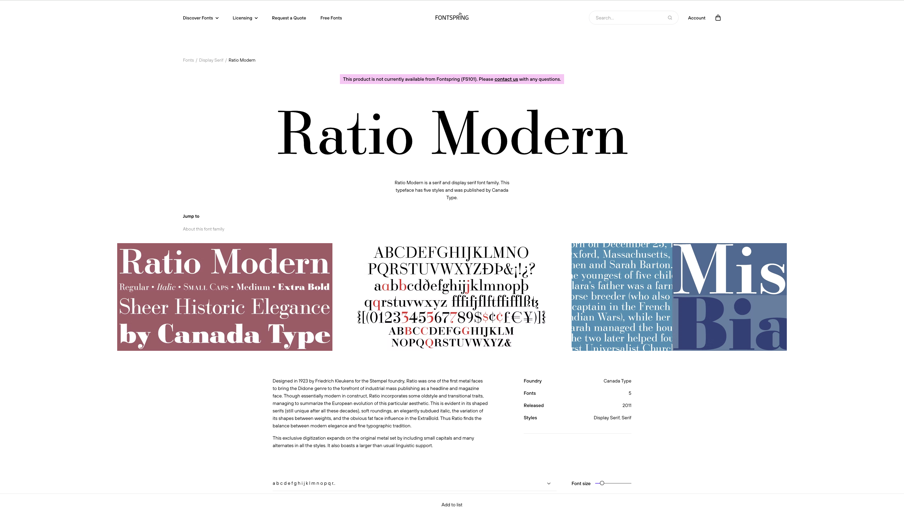
During this stage, I learned how much information a single letterform can reveal about a typeface. By reverse engineering letters and analyzing characteristics such as stroke contrast, stress, terminals, and proportions, I developed my own classifications based on visual observation. One challenge was that some letters shared similar features, making it difficult to determine their classification with complete confidence from a single character alone. To verify my findings, I researched the identified typefaces and compared them against type foundries and classification resources. This research was used to confirm and support my analysis rather than replace it, helping me better understand why specific visual characteristics correspond to particular type classifications. Through this process, I strengthened both my typographic analysis skills and my ability to justify design decisions with evidence.