1918 — 1981 · Designer of Words
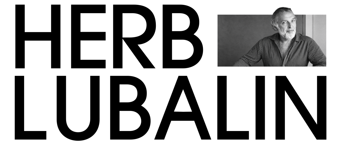
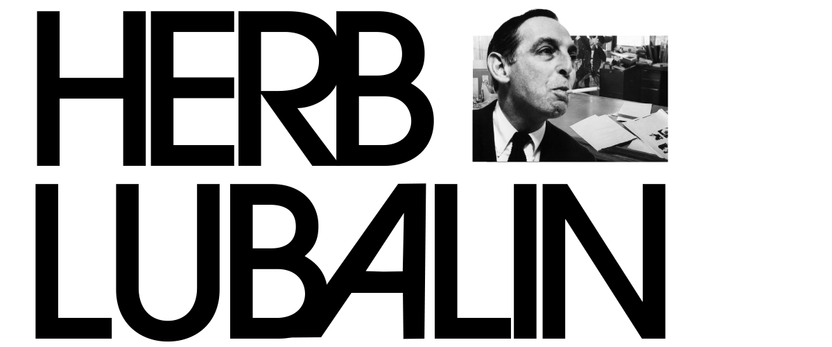
Scroll
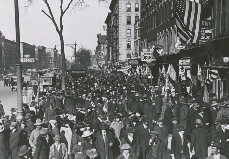 1918Born in New York City. Trained at Cooper Union.
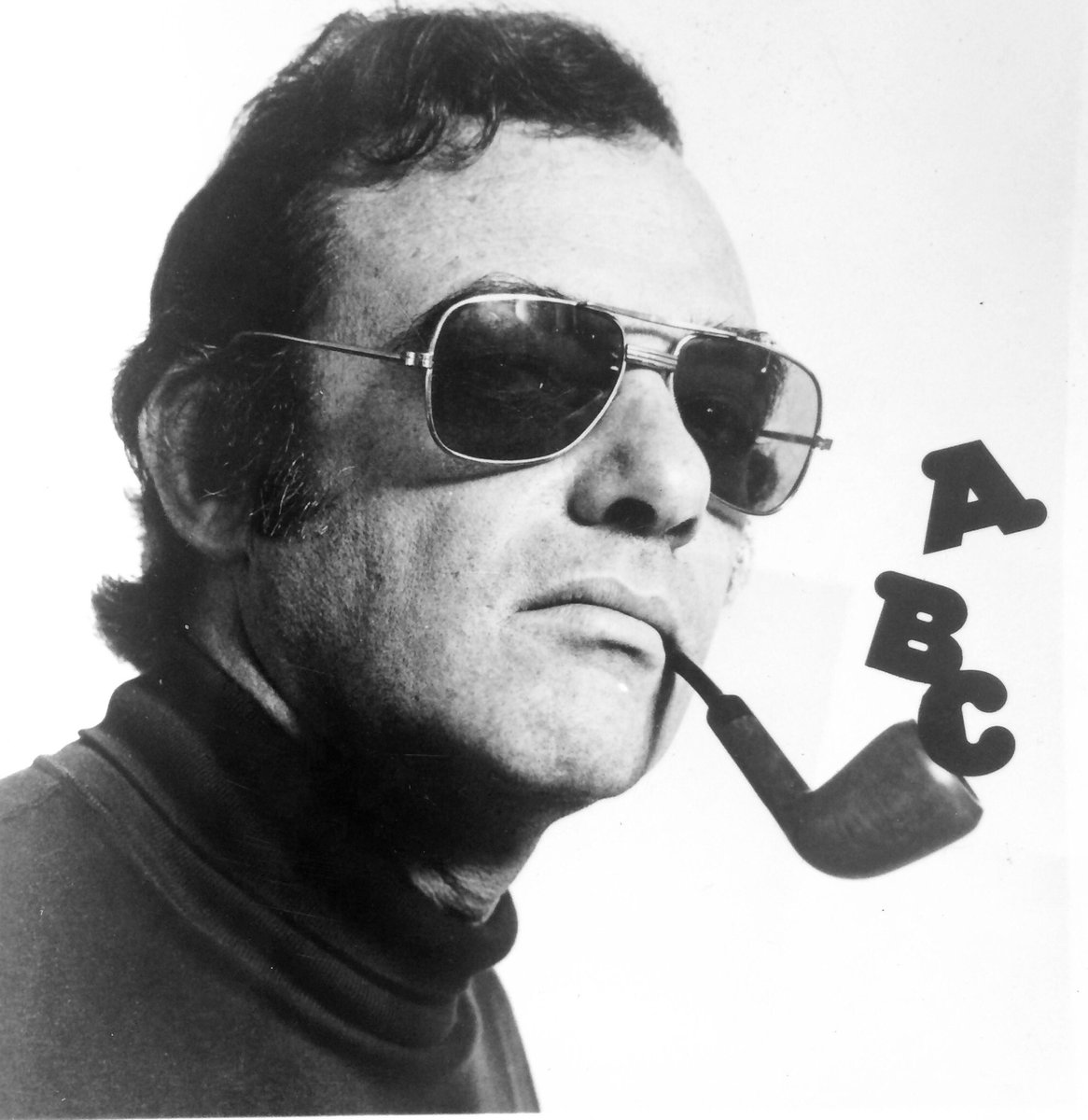 1945Joins Sudler & Hennessy, rises to art director within a decade.
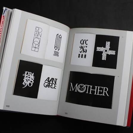 1961Designs the "Mother & Child" logotype — a full sentence built from one letterform.
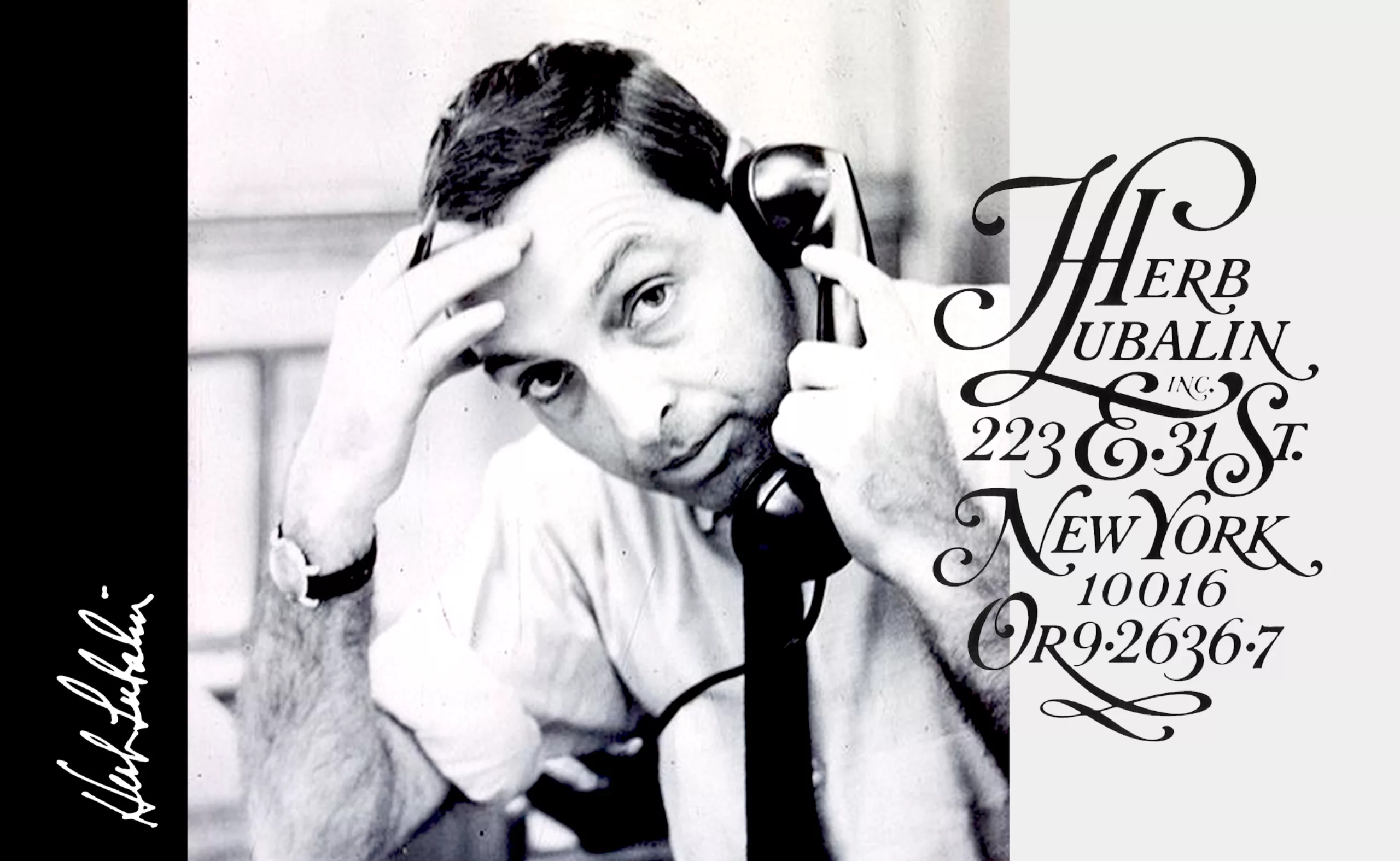 1964Opens Herb Lubalin Inc., his own studio.
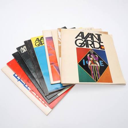 1970Co-founds International Typeface Corporation (ITC) and launches Avant Garde magazine.
 1971Designs the Families logotype for the Center for Family Planning — one wordmark, one embrace.
 1981Dies in New York, leaving behind ITC Avant Garde Gothic, Lubalin Graph, and a new visual language.
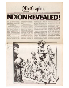
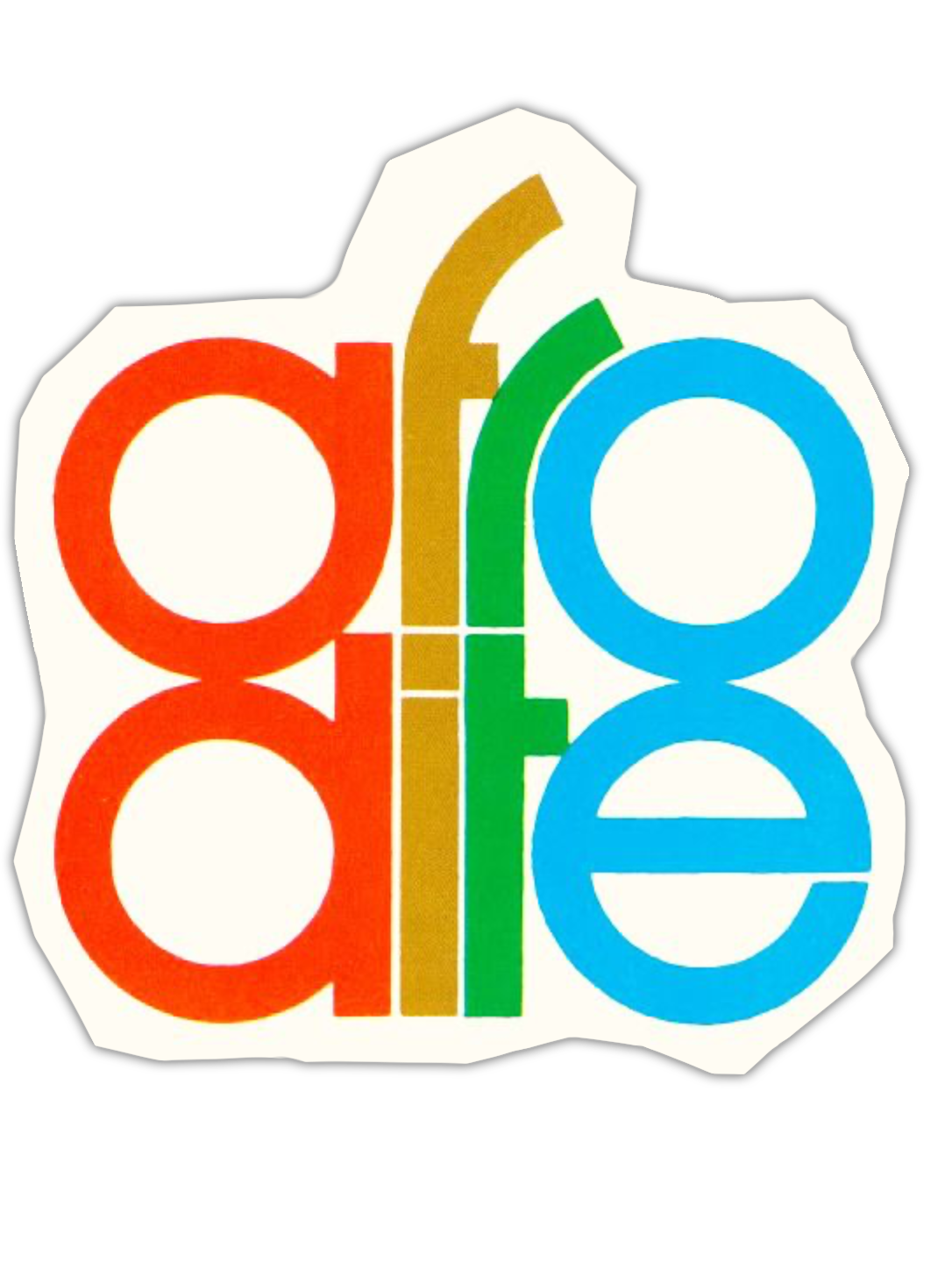
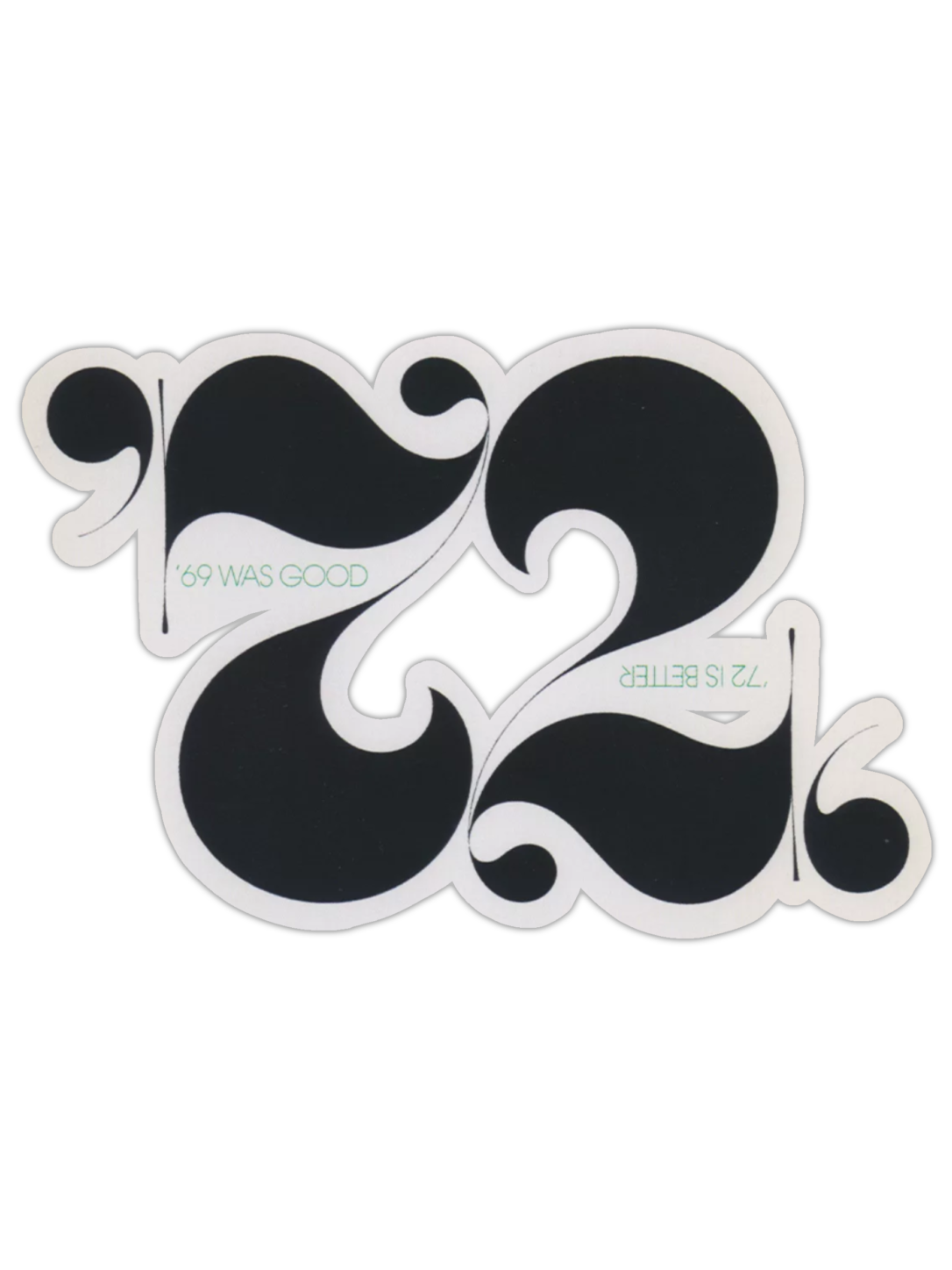
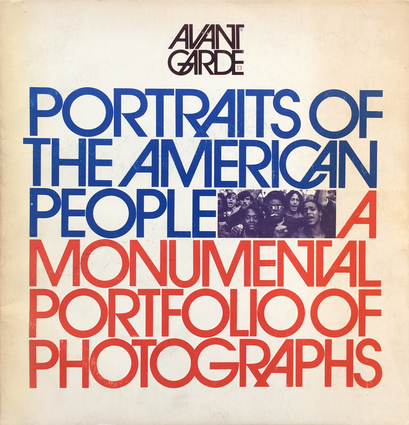
The masthead logotype became the era's most imitated piece of lettering.
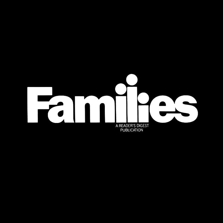
Letterforms link arms — literally — to form a single embracing word.
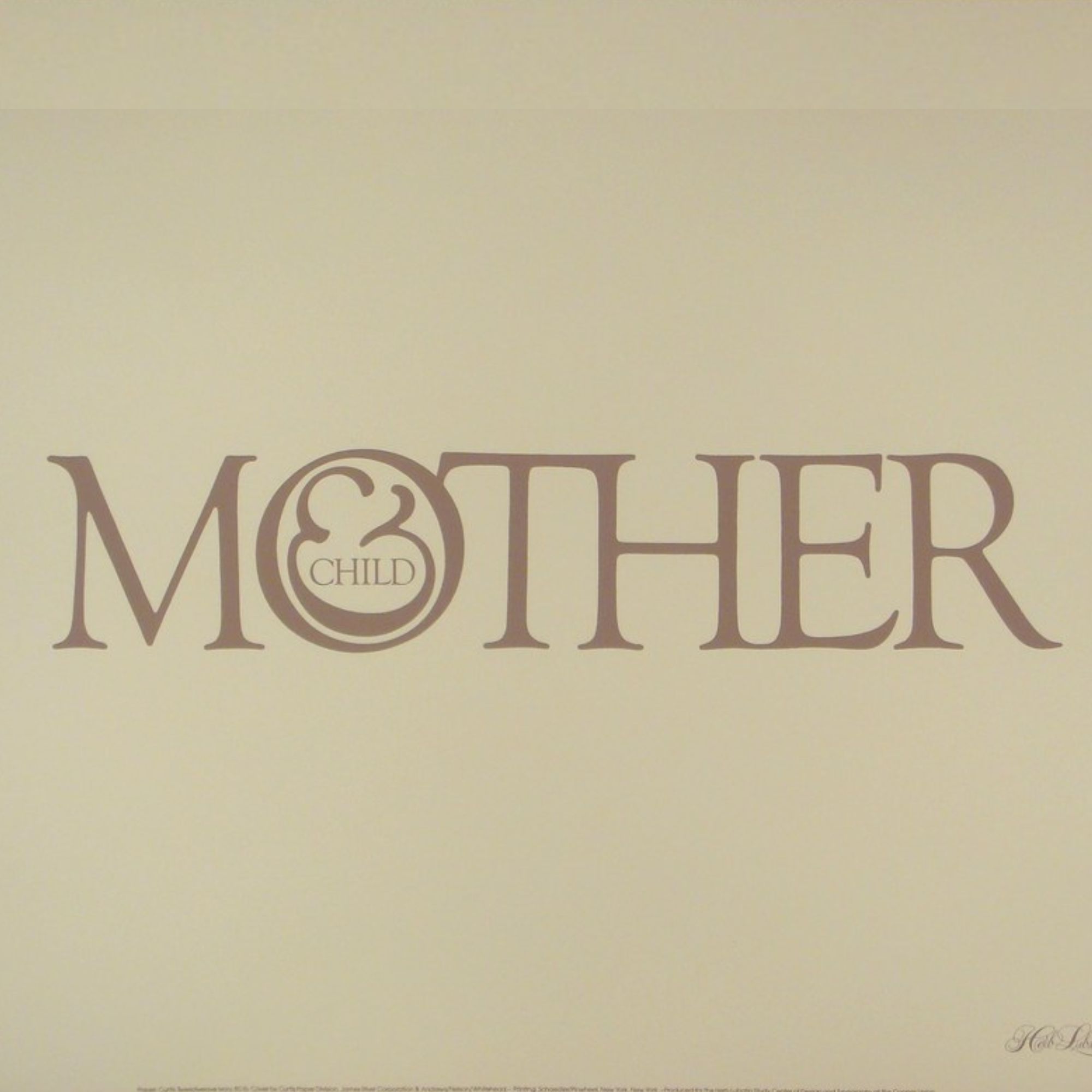
An ampersand drawn so tenderly it reads as an illustration, not a symbol.
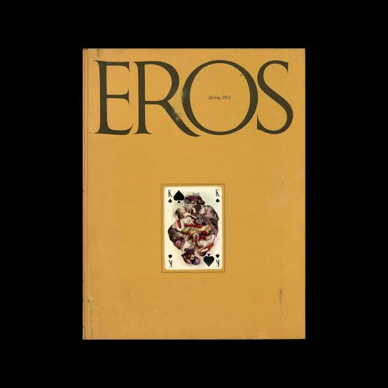
Only four issues, and yet one of the most referenced magazines in design history.
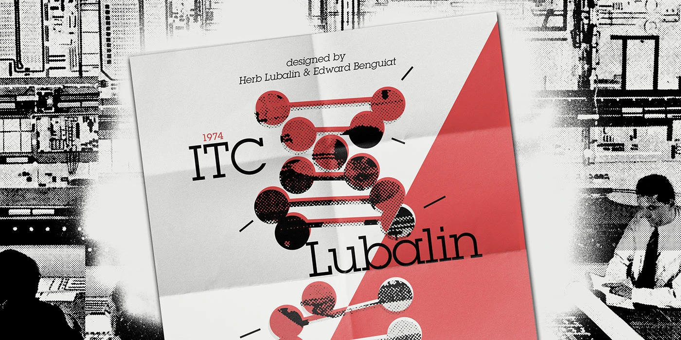
A slab serif designed to be read from across a newsstand rack.
The ampersand fuses directly into the neighbouring letters — no counter, no gap, one continuous stroke.
Letters are pulled far tighter than convention allows, so the word reads as one shape before it reads as text.
A heavy, geometric stroke keeps the mark legible at a glance — logo-scale confidence, not paragraph-scale caution.
Click a marker or a note — they're linked
Herb Lubalin drew this logotype in 1965, and it has outlived every client it was ever made for. Hover or tap a marker to see where each decision lives.
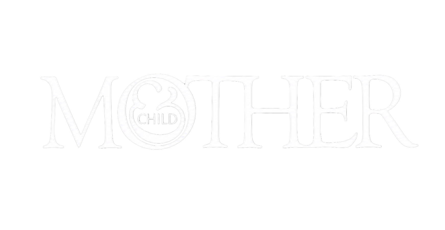
Lubalin never pulled a logotype off the shelf — he hand-built every letter: slanted, re-weighted, and pulled close enough to its neighbor to share a stroke. Click a letter below and shape it yourself, or hit Remix and let the workshop surprise you.
Every designer who has ever let a headline become the image, not the caption, is working in a room Lubalin built.